Falling in Love With Retro

As a photographer, I think there are three fundamental issues with social media, specifically instagram:
- Social media is too competitive. Many interesting photos never make it to instagram because they won't get that much attention. Plus, you can't post too much, or people will ignore your posts. If you want engagement, you're limited to 4 posts per week.
- Social media is too structured. Every post must be part of a larger event: a trip, a celebration, etc. This clashes with my philosophy of "Always carry a camera." Most of life happens in the in-between, and so most of my photos fill that space as well.
- Social media is too edited. RAWs must be adjusted. Borders must be added. Attention must be given to detail. Effort must be applied. These steps exist as another barrier to sharing more content.
The Premise
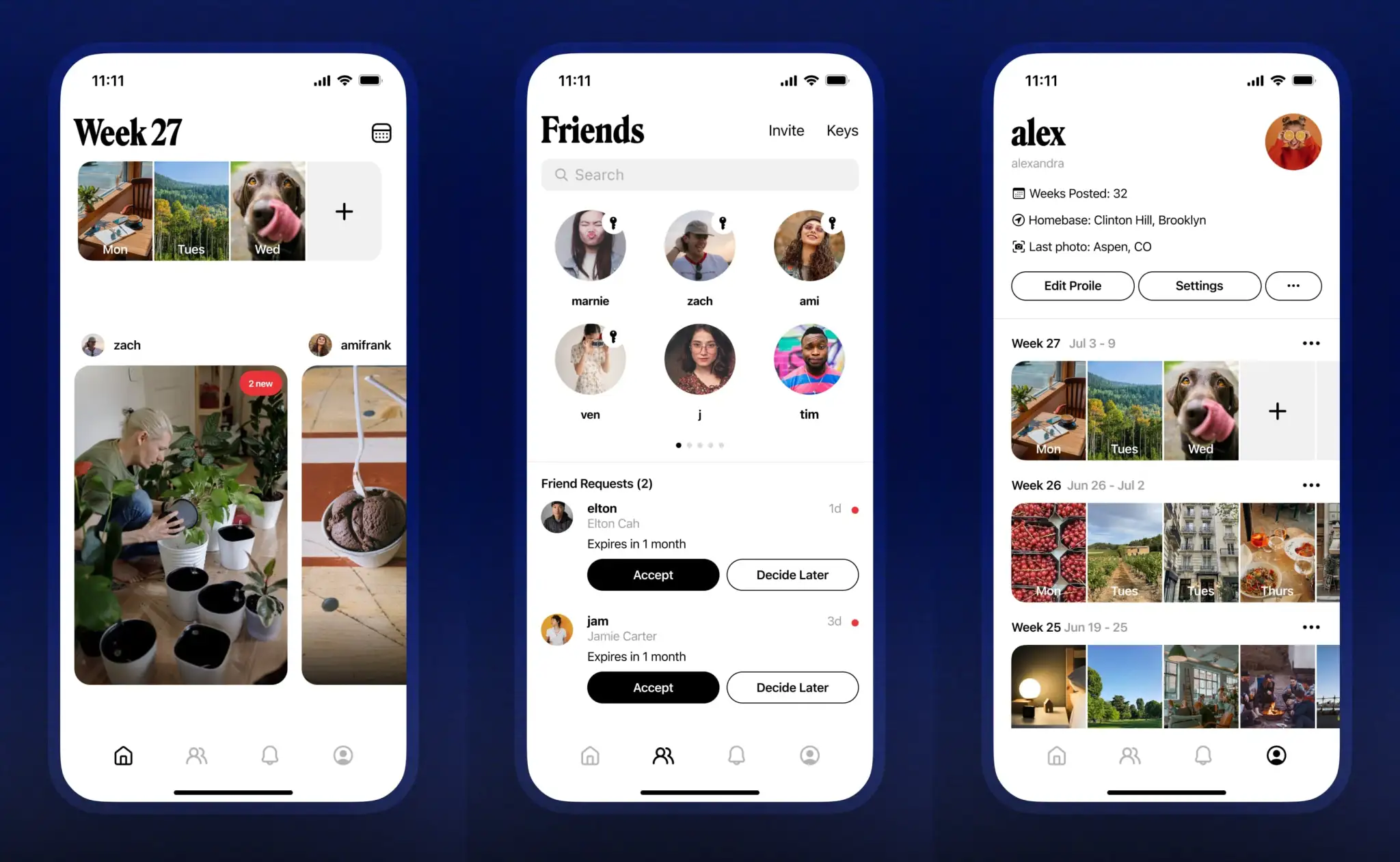
Retro is an unstructured, forgetful, private social photo diary app. It has no algorithms, no ads, and no bloat.
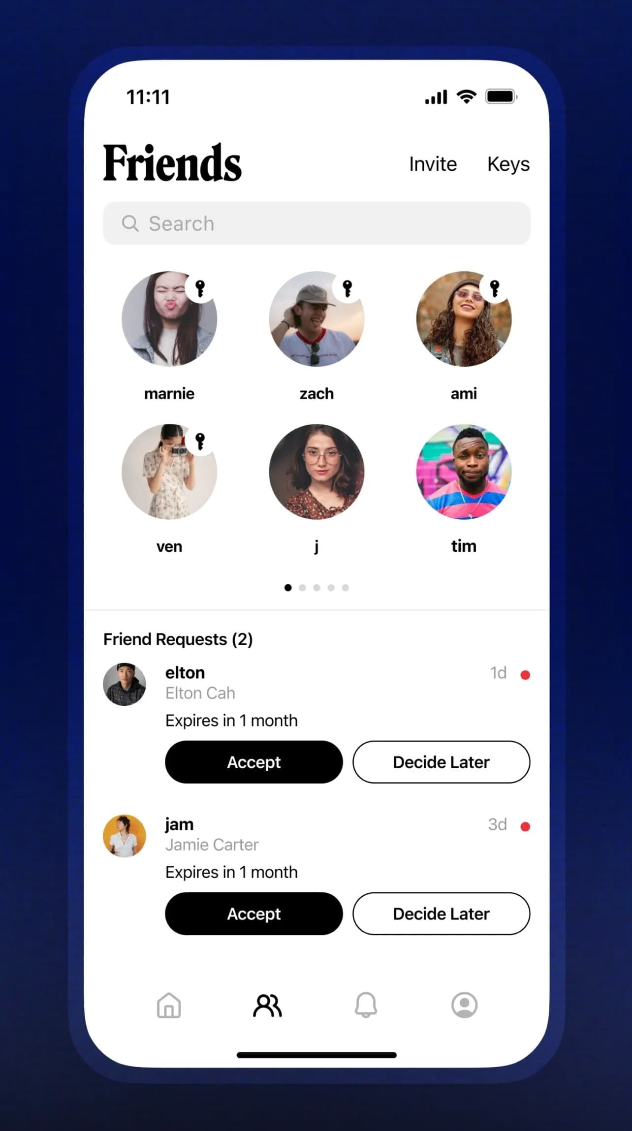
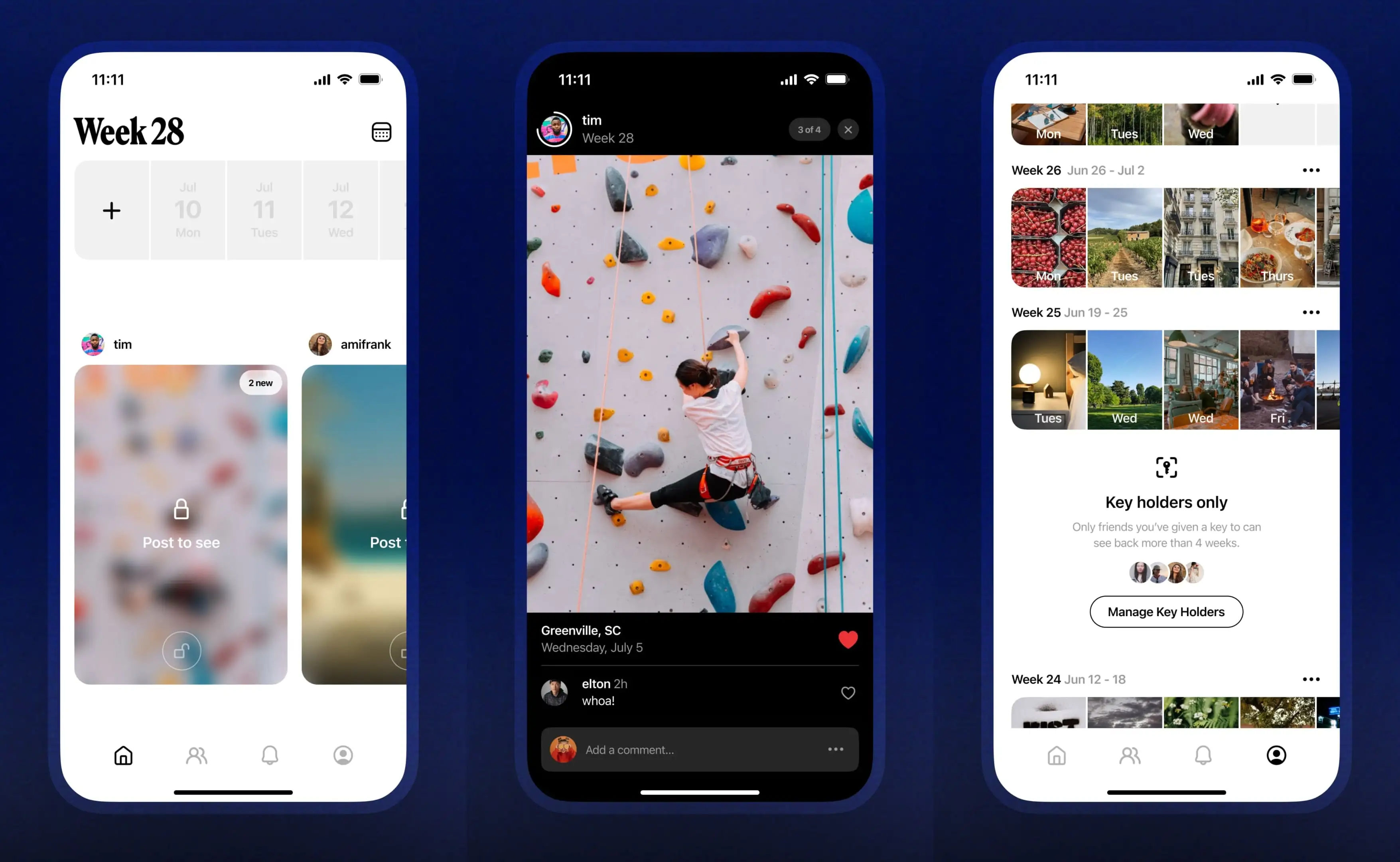
The concept is simple: add photos throughout the week, which can be viewed by friends. A new week means a new set of photos. You can only see other's photos once you've posted yourself. After four weeks, photos are hidden from your profile and only visible to a select group of "keyholders."
Although it's straightforward, I think Retro's minimal design solves every issue I've outlined above, and provides some additional benefit as well.
Competition
Retro has likes, but they're very different from what you see on an Instagram post. Likes aren't counted. Instead, you only see who liked a given image. The culture around giving likes is different, too. Because likes are attached to a single image rather than a larger collection of images, they're given more sparingly. To me, this makes them more meaningful: I'll like a photo if it's especially beautiful, or well-composed, and feel very rewarded when someone likes a photo I'm especially proud of.

Another big change with likes is their visibility. Likes are only visible to the poster, meaning that there's no pressure to "perform" better for a given week. In fact, it's not even possible to see likes without clicking through each individual photo.
Finally, Retro removes the concept of "Followers" entirely, opting for " "Friends" instead. Friends can see each other's posts, meaning each friendship on Retro is a two-way street: If you're going to add someone as a Friend, there has to be a mutual interest in sharing and receiving information. This means that there's not really the commodification of followers that exists on almost every other platform. In fact, similar to likes, you can't even see your "friend count," only a grid of icons.

Structure
I think there's a place for a happy medium between a photo dump and a curated Instagram post, and I think Retro fills that gap.
The issue in the status quo is that there are two ends of the social-media spectrum: on the one end, you've got apps like Instagram, Facebook, Twitter, etc. These sorts of apps all demand that you put time, effort, and curation into your posts. After all, they're going to be on your profile forever (or at least until they're deleted).
In addition, post-based apps require that you chop your life up into 10-image segments. Taking a trip? Best to wait until the end to post your photos. Want to post more than 10? Sorry. Multiple posts look bad, and won't get nearly as much engagement.
On the other end of the spectrum, you've got "real" social media. Apps like BeReal, Locket, and possibly Snapchat or Instagram Stories. While the premise seems fun, these apps have almost too little structure, to the point that they're hard to use. As a photographer, the ability to upload photos from my Fujifilm XT-3 rules out most of the options in that list. The ones left (Instagram Stories) are such a pain to use for photography (especially horizontal photos) that they're not really worth the effort, however "real" they may be.

Retro's strategy to structure is delightfully different. By grouping photos by week, you never have to divide your life into chunks. Instead, you post images that you like. I find that this incentivizes me to use Retro almost as a journal instead of social media, and I think my friends do the same. Additionally, hiding older weeks means that I can post content without worrying about it coming back to haunt me (other than for specific "keyholder" friends).
I also think forcing users to post before lurking is a net positive for the platform. While you might think that people would just post 1-2 images and then move on, I've found that people start posting once they get in the habit of it, and they put less effort into their posts. I think this is a good thing! There's simply more content, much of which is genuine and interesting, as opposed to hyper-curated 10-image posts once every few weeks.
Algorithm
Retro has no algorithm. None. Not for posts, not for friends, not for likes. Nothing. It's so refreshing to see an app not fall into the ML/AI trap that has its fist wrapped around almost every platform.
All this means is that you see content that you want. No "suggested" posts you can only disable for a month at a time. Retro seems to have taken the opposite approach to Threads (which only gave you an algorithmic feed for its first few months), and I think it's paid off.
There's honestly not a lot else to say here.
Closing Thoughts
If I had to choose one word to describe Retro, I think it would be serene. It feels like an oasis in the desert of algorithm-infected, ad-riddled, detached platforms that make up "social media."
If you want to try out Retro, you can at retro.app.
Needless to say, this post was not paid for nor solicited by Retro. I can guarantee that a majority of my readers would never support shameless pandering (the other one did not comment).